 Meeting criticism on criticism, it seems that the branding Mauritius is a task too tough just yet! Like it or not we'll have to make a choice and those undecided have two more weeks until December 9! So, let's talk design and try to figure out which one would suit us best...
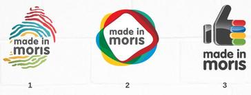
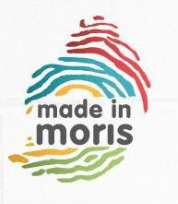
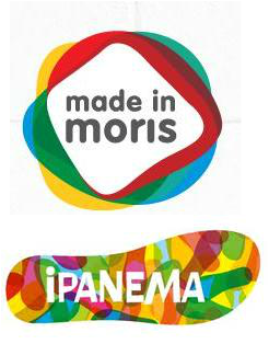 Let's see what's going on with the second option. It reminds us of some attempt to again remind the buyer of Mauritius' multi-cultural nature (with the intertwined colors which mix together for some parts) and incorporating this is some sort of a circular shape is ingenious- but too intellectual this time. As much as the first option was nothing more but a literal design ( for example, for IT giant Apple, the logo is an apple), the second option is way too much of someone trying to add layers over layers of meaning to the logo. My guess - an over-thought design which could easily pass off as a cousin industry to Ipanema! Indeed, at first glance, I was like "Wait a sec, this reminds me of Ipanema!" Then, on second thought, you might think it's some fancy beach wear brand, or even some Water Sports Resort - don't you see the link with swimming pools and cocktails and fun? This is the vibe I get of it. Who knows, maybe it was meant to have this effect!
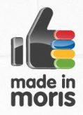
 Final note, we can't possibly miss the wording: made in moris. First up - is our English name "Moris" ? I don't think so. I heard "Made in China", "Made in US", "Made in Malaysia" - all names are in formal English. It makes no sense to mix up English and Kreol Morisien unless of course it's a super-subtle reference to our official/spoken language in Mauritius! Doubt it!
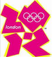
I would like to know who came up with these designs- I bet they must have cost us all an arm! You've got the answer - let us all know by posting down here! I do realize it's really late to come up with this, but with a will to imitating -not copying! (We all know that imitation is the best form of flattery, so it's allowed :P) - what the UK did for the logo of London 2012 Olympics. Of course, I'm not talking about coming up with one of the most-criticized logos in Olympics history (although the logo options have been making us all talk anyway!); I'm talking about the way they proceeded with it's conception. The organizing committee opened up the doors of design to the British population who sent thousands of proposals until one was selected! Why has this not been done here? It would have involved the whole population and quite frankly, we'd all be aware of the branding process and less investment would have been needed on asking, coaxing, forcing the population to VOTE online. Anyway, things are as they are and I can only offer food for thought at this point. You have 2 more weeks to choose our national brand logo until votes are closed on December 9! Here is where you should go: madeinmoris.mu but bear in mind that although it's going to be a tough decision because neither looks better than the other, it's our duty as citiz! Until then, why not send us your designs? We'd love to see what you readers can come up with! Sine Cera
13 Comments
"Made in Mauritius" would've been better indeed; because the outside world is obviously unaware of the meaning of "Moris". But if we try to pinpoint out a positive facet, maybe this name will encourage many to research on our creole language...maybe.
Shiv
11/18/2012 06:52:56 am
The 3rd logo is a big NO.
Kelvin
11/21/2012 09:35:04 am
Thanks for the educated comment !
Alex
11/22/2012 07:29:15 am
The second is simply awesome. : )
Nilinka
11/25/2012 03:19:25 am
I'd definitely go for the 1st one , it does serve the purpose , that is , showing the world (buyers) that the particular product bears the fingerprint of MAURITIANS . Seriously , I don't see the harm in having the 4 colours of our national flag but the 'made in moris' is a definite no-no - the colours , the fingerprint , and the island flaunt a strong message ;)
Kelvin
12/1/2012 04:33:03 am
Simply because one is not to your taste, doesn't mean you should promote the other one. What I mean is, even though, you don't get the 2nd logo, the 3rd one is simply MY big No-No. Don't you see how it transpires of like some sort of 'cheapness' ?
Nilinka
12/14/2012 05:44:03 am
Hola ! don't shout at me ! i voted for the first one :D
daisy
11/27/2012 01:22:53 am
I vottr for the 3rd one, its modern n indicates a like button for the products madd in mtus.
Kelvin
12/1/2012 04:30:51 am
I love how daring you are to openly declare how you voted for the only one I urged my readers not to pick! Then again, thanks for sharing your opinion.
Atiyyah
3/8/2013 08:06:26 pm
none of them! the first one is too complicated for a logo and the "made in moris" is not even well-centered Leave a Reply. |


FREDERIC M
In need of Beauty products ? Does your skin need some healthy boost ? Wait no more - CONTACT US now and enjoy our large panoply of Beauty & Health products!
Archives
June 2014
Categories
All
Kelvin
Fashion is a passion, writing another. So I thought - why not share them through a blog? Et voila! I hope you enjoy your time around here... |

 RSS Feed
